The Glass Half Full.

Climate change alarmists claim the planet is getting warmer due to CO2 acting like insulation.  Actually, it isn’t getting warmer.  What the actual daily temp data shows is that winters are getting shorter and less cold.  But wait, isn’t that just saying the same thing?  No it is not.  The two are very different.

I will explain why with a series of analogies.  This glass, is it half full or half empty?

GlassHalfFull

What you answer is often claimed to be a view of how you see the world.  But in reality, how you answer is about how the water became half way in the glass.

If the glass was half filled, with new water (this is key), then it is half full.  If the glass started filled to the top then half removed, it is half empty.  If you don’t know which of those happened, then the best you can say is the glass contains half its contents.

How does this relate to temperature changes?  Well, the first case, filling the glass, is new water.  However, the glass emptied does not contain new water.  It contains the same water you started with just reduced by half.  What’s left is not new water.

Here’s another example.  You earned $1000.  The tax rate in your country is 75%, hence once tax is paid you get a net of $250.  A new government gets elected and they change the tax rate to 50%.  So now you get to keep $500 instead of $250.  Does that mean you have more income?  Is the $250 new money?  No, it means the government takes less of the money you already earned.

So how does this compare to temperature?  If winter temps go from -20C to -10C does that mean the winters got warmer?  No.  If summer night time temps change from 15C to 20C does that mean the day got warmer?  No.

It’s no because the 10C difference in the winter is not new heat.  It’s not new energy.  It is less of a loss of summer energy that was already there and lost during the winter.  Same with the day temp range.  The sun heats the planet during the day, say to 30C, and cools at night.  That is, the energy is already there in the mid day and is lost when the sun goes down.  Going to 20C instead of 15C at night isn’t new energy, just means less energy is lost.  That 5C “increase” is not new energy.

Climate alarmists will just say this is all semantics.    Of course they have to say that to keep the warming alarmism alive.  But the reality is that the “warmer” isn’t new energy.  It’s less of a loss of energy that was already imparted to the planet from the sun.

Posted in Uncategorized | 1 Comment

Middlesex Centre’s Stormwater Tax based on a Fraud, Part Five

We live in a strange world today.  A world were feelings dominate everything.  It doesn’t matter what the physical evidence says, if it hurts someone’s feelings it can’t be true, and can’t even be allowed to be shown.

When I was at the meeting last month at Town Counsel I talked to a few people from the Municipality at the door as we were leaving.  The claim of there was more rain and heaver downpours kept coming up.  I objected saying the data from Environment Canada says no, that is not true.

It was suggested to me that I call Environment Canada for clarification.  Clarification of what?  What would someone at EC tell me that is different from their own data?  They have different data than is on line for the public?  Of course not.  The inference must have been that I was misinterpreting that data.

It is common for those who have their views challenged with real world data to have that someone then challenge my abilities at crunching the numbers.  It’s not rocket science.  Anyone with basic high school math can do what I did.  Oh, but of course, we live in a world of Liberal New Math…

But that isn’t what’s going on here.

Council has made their decision about implementing this new tax, based on what they assumed was valid data.  But now that this has been shown to be false.  That in fact the reports out right lied, as well as used computer programs to make predictions, predictions of which violate the laws of physics.  In short, the tax was based on fraudulent data.

So will Council reverse this and drop the tax?  Nope.  Not a chance.  Feelings are involved here.  Council feels that they need this tax, even if they actually don’t need it, and likely will never use it, and today feelings trumps everything.  Including what is the reality.

Here is more reality that Council needs to consider, but won’t.  How long will they keep this tax going?  How much money do they need in the bank for something that is never going to happen?   And in 20 years time, when little of that money was actually used because the predictions didn’t pan out, what happens to that money?

It will be used for other things, that you can be sure of.   Why?  Because we are also living in another fantasy world, that of ever growing government deficits and increasing debt.    And not just in Canada.

For the first time ever in human history we have negative interest rates.  That’s right.  Japan, Switzerland and a number of other countries, their central banks are paying governments to borrow money.

There is fear that if interest rates go up, that people, corporations and government will see higher interest costs.  Not going to happen.  If interest rates were to just double, which is only from 1% to 2%, still significantly low by historical standards, just about every government around the world would go bankrupt almost immediately.

As you have seen in the news, many European Union countries are on the verge of economic collapse.  Greece for example, but Italy has a very high rate of debt defaults, and Spain is within 18 months of not be able to make their social security payments.

Hence the negative interest rates.  Interest rates are not going up.

But still, with all the taxes governments take from us, including here in Canada, they don’t have enough and are going into deficit on a huge scale.  Ontario has been driving that road for 13 years now, with no end in sight of ending deficit financing, and the Federal government is tagging along already.  People actually voted for the Liberals who ran on a platform of deficit financing. I shake my head in disbelief.

But Municipal governments can’t go into deficit, so they raise taxes to deal with their cost increases.  Couple this with another factor of our society that is unique.  Infrastructure is getting old and has to be replaced.    But there’s no money to fix it.

Raising taxes isn’t the solution either.  For every dime governments take from us, is a dime that isn’t spent in the general economy.  Oh, but, they say, that money is spent on the economy.  Government spending creates jobs.

Again, feelings is trumping reality.  There are two types of jobs in a modern society: Wealth creating jobs and wealth leaching jobs.  Most jobs of the private sector that make things create wealth, and hence those jobs are wealth creating jobs.  All other jobs, and most, if not all, service sector jobs are wealth leaching jobs.  They consume wealth, not create it.  But those service sector jobs and government jobs are required to keep the wealth creating jobs going.

Except there has to be a balance.  That is, the taxes imposed on the wealth creating jobs pays for the wealth leaching jobs.  For an economy to grow, there has to be more wealth created than is consumed.  But that isn’t what is happening today.  Today, the government is leaching more and more of wealth creation jobs by imposing taxes, and taxes upon taxes (the Carbon Tax).  Couple that with policies, such as energy and climate, that drive businesses out, reducing the wealth creation jobs even more.

Eventually, the system collapses.  Don’t believe me?  Have a look at what happened in Venezuela.  It is in total economic collapse.  People are starving because they can’t get food produced, and their economic activity is so destroyed by socialist policies, they don’t have the funds to buy aboard.  It is a humanitarian disaster that the Main Stream Media is completely ignoring.  When was the last time you saw on the news about the daily rioting happening in Caracas?

Never. Why not?

Because it hurts the feelings of those who claim a socialized society, with large government, is the best society.  Many in Notely’s NDP government once touted Hugo Chavez as a great man implementing the perfect society through socialism.  The NDP’s LEAP Manifesto was based on Chavez’ vision.  Now they are silent.

Society today is run by people who have the following feelings.

  • Big government is better,
  • Humans are a scourge on the planet and need to be highly controlled (climate change and energy are examples, plus UN Agenda 2030),
  • There are too many people on the planet.  Well, too many Western people anyway,
  • Western people screwed up civilization and need to feel guilty and pay for their past sins.

I would have expected this Council to be more conservative and not fall into the trap of socialism-is-better mentality.  But it seems they have elected to go that route (such as accepting, blindly without question, that humans are causing catastrophic climate change, regardless of the science papers that rebuke that theory).

There may be a ray of hope on the horizon, however.  There is a lawsuit making its way through the courts, and should be heading to the Supreme Court of Canada soon, against the Bank of Canada.

The Bank of Canada was set up in 1935 in the wake of the Great Depression to provide a means for settling international accounts and to provide interest-free loans to government to finance infrastructure investments.

We can hope this gets a positive ruling, which would force the Federal Government to reinstate the Bank of Canada’s role of funding infrastructure.  The argument against this is that it would cause inflation.  In fact, the Venezuelan situation was largely because the government was just printing money for everything.  But that isn’t what this would do.

Governments borrowing money is doing the exact same thing.  By borrowing money in the market place (your Canada Savings Bonds for example) is putting new fiat money into the economy for projects anyway.  Yet that new money isn’t causing inflation.  So the Bank of Canada funding projects with new fiat money also won’t cause inflation when used for infrastructure projects.    The difference would be profound.  Governments wouldn’t have to pay the money back.  They wouldn’t have interest payments to make.  And they wouldn’t need to tax us so much, freeing money to be spent on wealth creating jobs as people buy more things.

But don’t hold your breath for this relief.  Feelings will continue to rule our lives, regardless of reality.  Personally, I feel that the insane are running the world.

Posted in Uncategorized | Leave a comment

Middlesex Centre’s Stormwater Tax based on a Fraud, Part Four

By J. Richard Wakefield
June 30, 2016

In this Part I want to go into more depth about the claim that there will be more violent storms dropping more rain in them.  The short reply to that statement is it is false.  Not only that, it is a prediction that violates physics.

You will recall this graph from Part One.

bellville-total-percent1

This is the percent of time (X-Axis) vs each millimetre rain drop on any given day (Y-Axis).  In Part One I used Woodstock.  In this case I used data from Bellville as it has a very long unbroken record of data. (I was going to use Toronto, as per the report’s claim that their data was from Pierson Airport, but that data is too short and has gaps in it.)

What is interesting is the two graphs are identical.  That means, the percent of time of each daily rain drop is the same across the province.  The equation that follows that graph is the same regardless of location.    We will expand on this in a moment, but I want to also show that there is no over all trend in Bellville of total precipitation.

bellville-total-precip1

Notice the clear 30 year cycles, which means we are just leaving the latest, with the next cycle repeating in some 15 years.  But over all there is no increase in the amount of precipitation since 1902.  Also notice the two years in the late 1940s that had more rain in those years than the high in 2006.    Note also the drought year in 2009.

The interesting thing to remember is the high amount of precipitation in 2006 would have been blamed on global warming as an indication of things to come.  Also, the 2009 drought year was blamed on global warming as an indication of things to come.

Right…

So, back to the decay curve and the claim that there will be more rain, and more in one day, in the future.  What would that mean for that curve?  There are three possibilities, but as you will see all three are physically impossible.

The first is their direct claim.  That rain in the future will be heavier, and more frequent, at the high end.

However, so-called “25-year” and “100- year storms” have become more frequent in recent decades. Traditionally, “25-year storms” have a 4 percent chance of being equalled or exceeded in any given year and, therefore, an average recurrence interval of 25 years. Similarly, “100- year storms” have a 1 percent annual probability of being equalled or exceeded. That is, they have (or had) a probability of occurring just once every century, although cities are now experiencing them in shorter intervals.34

(Reference 34 is just this, which isn’t a study at all, but an opinion by the City of Toronto Water Works manager.  The last part of the quote, “cities are now experiencing them in shorter intervals” is absolutely false.  There is no evidence in the data from Environment Canada for that, anywhere in Ontario.  Welland and Woodstock have seen a reduction in rainfall in the last 25 years.)

With 100 years of data, even a significant increase at the high end would hardly be seen in that graph of percent probability, so I used only the last 25 years data to make high end events show better.  This is what that looks like:

bellville-25-prob1

As the graph states, if there is more heavy rain more often, that end line would have to be higher.  But how?  This?

bellville-25-prob_21

To get that blip, I had to have 30 days in that 25 year period of a day of 100mm of rain, and another 30 days of 110mm of rain on one day.  That’s not an exaggeration to some of the alarmist claims of more rain, one or two per year.

But clearly, that bump violates the mathematical equation that produces the graph of regular rain fall pattern.  Hence that isn’t going to happen in the future.   To follow the laws of physics, the integrity of the line must be preserved.

The second possibility is this:

bellville-25-prob_31

But for this to happen, total rain would have to increase, substantially.  Which it isn’t anywhere.  Two other problems with this scenario is at the low end of rain, say one millilitre per year, would have to happen more often than today.  That means we would have to have more rainy days in the future.  The other problem with this scenario is the right end.  To tapper off to zero percent we would have to see rain days of more than 120mm.

Not one day in the entire data set has rain in one day more than 130mm that I have seen so far.  There appears to be a limit to how much rain can fall in one day.  We will get to that in a moment.

The third scenario is that the lower end rain days don’t change, but the higher amount days do, like this:

bellville-25-prob_41

Even this scenario has problems.  It expects there to be more rain at the higher rates only, without affecting lower rates that have the higher probability.  Doesnt make sense either.  And it still has the same problem at the right side of the graph as the second scenario.  Where is the upper limit?  Is there an upper limit?

That brings us to a little bit of meteorology so you understand why it rains in the first place, and why higher rates in one day are so rare.

The main cause of rain in Ontario is when a moist warm air mass from the Gulf of Mexico collides with a cold dry air mass that drops down from the Arctic.  A low pressure system is created at the centre of that collision, which produces this map that you have seen so many times on the Weather Channel.

tstorms3-0530_zpsqeiahzcd 
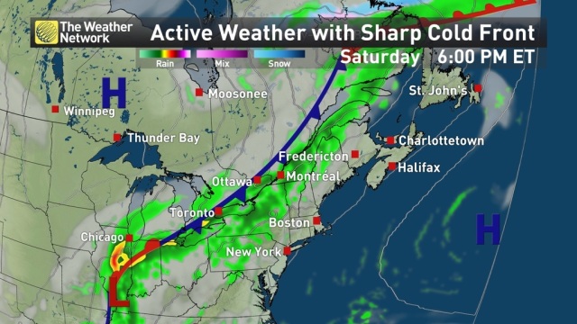
The greater the temperature and moisture content between those colliding air masses, the more violent the storms it produces.  Those fronts travel from west to east, and within a day, the storm front passes us in London, and moves off to drop east ward all the way to the Atlantic.

So it’s all over within a day or so.  The atmosphere can only hold so much moisture in the warm air mass.  So the amount of rain cannot go above that.   Hence the claim of more intense rain violates the laws of physics.

But what about those real heavy days then?  When it rains all day for days in a row?  That happens when the jet stream passes right over us, with a low bulge to our west, and a high bulge into Quebec.

jet-stream-highs-and-lows

If the jet stream is stationary (doesnt move eastward) and the low pressure system follows that line, we can get days of rain, and a lot of it if the conditions are just right (big temperature difference between the air masses, and a lot of moisture from the Gulf.).

Clearly, because of the chaotic nature of the climate system, that is a rare event.  Climate change isn’t going to make that worse.

If anything, global warming should make storms less violent with less rain in them, if one follows the laws of physics.  The claim of the global warming people is that the Arctic would warm faster than the tropics.  Recall that the intensity of a storm is directly in relation to the difference in temperature of the colliding air masses.  The lower the different in the two, the less violent the storms, and the less amount of rain would fall.

In their zeal to scare you into submission because of human caused climate change, the High Priests of Global Warming are violating basic physics.

The bottom line is it is physically impossible for there to be more rain per day in the future.  There is no evidence anywhere in the world, let alone Ontario, of any increase in precipitation beyond the normal variation we have seen in the last 100 years.

These predictions are based on flawed computer models, and are not evidence.  Yet our politicians plow ahead as if things will actually become that worse case scenario.

Part five I will sum up.

Posted in Uncategorized | Leave a comment

Middlesex Centre’s Stormwater Tax based on a Fraud, Part Three

J. Richard Wakefield
June 21, 2016

At a meeting the residents of Middlesex Centre had with town council, I had a brief few words with the mayor.  I pointed out that human caused climate change is the biggest hoax ever perpetrated on humans.  His reply is the standard one gets to such a statement.

“97% of scientists agree we are causing the climate to change.”

Think about that for a second.  How many scientists are there in the world?  10 million? 20 million?  No one really knows.  And what value would an archaeologist’s opinion on climate change be worth?  They, along with chemists, and a few other disciplines that have nothing to do with research in climate science, would only parrot what the climate scientists would be saying, assuming climate scientists know what they are doing.  Right…

So is that 97% agreement of the world’s scientists really true?  Nope.  It is the biggest lie ever inflicted on the people of the world.  Certainly those who have a vested interest in keeping the human caused climate change myth alive want it to be true.  So it became true.

The reality is that the 97% came from this paper by John Cook of the inappropriately named science blog Skeptical Science.  The survey wasn’t of the worlds 10 plus million scientists.  It wasn’t even a survey of climate scientists.  It was a survey of a handful of abstracts in the scientific literature.

Soon as it was published it was immediately condemned in the science community as being completely flawed, if not a total fraud.  See here, here and here.

“0.3% climate consensus, not 97.1%”

Only 41 out of the 11,944 published climate papers Cook examined explicitly stated that Man caused most of the warming since 1950.

Nothing about that, of course, in the press.  Keep the myth alive at all costs.  Why?  We will see at the end of this.

The 97% isn’t the only lie, however certainly the biggest of them all in climate science.  But there are many other lies that are being exposed to no avail.   In the report the Council used, on page 3, we have this statement under the heading Climate Change.

A report by the Intergovernmental Panel on Climate Change states that, on average, temperatures in Canada increased by more than 1.3 degrees Celsius between 1948 and 2007 – a rate of warming twice the global average.30

Reference 30 isnt even a science paper.  It’s this:
Raveena Aulakh, “IPCC Report: Canada at Greater Risk From Climate Change,” Toronto Star, September 30, 2013.

It’s an opinion piece in the Toronto Star!

So what does the actual science say?  I downloaded Environment Canada’s daily temperature data for a number of cities in Canada.  Few go back 100 years, but Ottawa (Station 4333) does.  I have posted a detailed analysis of temperature data for that station here. The bottom line is that summer temperatures have actually gotten cooler.  The growing season increased by some 30 days, and winters have been getting less cold.

Don’t take my word on it, how about this science paper from the year 2000.

On page 406, the author states:

It is apparent that warming in spring maximum temperature contributed the most to the positive trend in the annual mean of daily maximum temperature.

He noted that the temperature changes over the last 100 years has not been even across Canada.

The greatest warming, which is in the Prairies, is about 1.5 over the 99-yr period.

There’s were the 1.5C seems to have come from.  He concludes with:

Like other parts of the world, Canada has not become hotter (no increase in higher quantiles of maximum temperature), but has become less cold.

When you look at the data what you find is that in the period 1900 to 1930 Ottawa, and most of south eastern Canada, had short hot summers, with long deep cold winters.  That trend shifted (recall from Part Two about cycles and climate shift trend changes) to longer cooler summers, and shorter milder winters.  Spring arrives sooner for the most part.  And this is somehow a catastrophic future?

The paper also discusses precipitation.  Figures 8 and 9 show rain and snow changes.  It is interesting to note that Southern Ontario doesn’t show any change in snow accumulation, but does show an increase in rain.  However, he notes:

Annual precipitation increased by 12% in southern Canada during 1900–1998. The increase in total precipitation resulted from a steady increase during the 1920s to 1970s.


Figure 16 of the paper shows that the only places that experienced any increases precipitation was those areas where it was warmer.  That is mostly on the west coast, and hence doesn’t include Southwestern Ontario, where we experienced dryer and cooler temperatures for the most part.

He concludes with:

Total precipitation has also increased over the last 99 years by 12% in southern Canada. It should be mentioned that the increases in annual precipitation totals do not directly relate to the period of increased cloud cover. Precipitation has a steady increasing trend from the 1920s to 1970, while the major increase in cloud cover occurred during 1936–1950 in mid-latitude Canada (Henderson-Sellers, 1989). The Total precipitation has also increased over the last 99 years by 12% in southern Canada. It should be mentioned that the increases in annual precipitation totals do not directly relate to the period of increased cloud cover. Precipitation has a steady increasing trend from the 1920s to 1970, while the major increase in cloud cover occurred during 1936–1950 in mid-latitude Canada (Henderson-Sellers, 1989). The precipitation trend appears to have stopped in about 1970 for the annual time series but not for seasonal time series. There were increasing trends in winter and autumn, decreasing trends in spring and no trend in summer (not shown).

The ratio of solid to total precipitation has also increased; but the trend is not significant. Decreasing trends were observed mostly in southeast Canada in spring. These may be related to changes in both precipitation and temperature and will be discussed later. The time series of the areas affected by abnormal/extreme precipitation and temperature show gradual changes, suggesting the trend detected in precipitation and temperature was not caused by climate jumps.

Sounds complicated.  That’s because it is.  It’s the climate!  Nothing in the climate is simple.

Now we get back to the human caused climate change and how that unproven assumption underlies everything.

In all other sciences, to establish a connection between event A and event B it is required to run laboratory experiments.  Tests are run over and over, referred to as double blind tests.  But that hasn’t happened in climate science. As we saw in Part Two, 95% of climate science is done with computer models.  NO EXPERIMENTS ARE EVEN POSSIBLE.

Why?  Because we can’t turn back the clock, remove human industry from the face of the earth, along with all humans, and watch to see of the climate doesn’t warm.  But even if we could do that, it wouldn’t tell us anything.

Recall in Part Two were I stated that changing the initial conditions can have a radically different ending.  That’s the nature of chaos theory.  One would have to go back in time and rerun the climate for thousands of test runs!  Only then could one get enough statistical data to make any conclusion.  Obviously, that is not possible.  So we are stuck with flawed computer models.

A plethora of integrated assessment models (IAMs) have been constructed and used to estimate the social cost of carbon (SCC) and evaluate alternative abatement policies. These models have crucial flaws that make them close to useless as tools for policy analysis: certain inputs (e.g. the discount rate) are arbitrary, but have huge effects on the SCC estimates the models produce; the models’ descriptions of the impact of climate change are completely ad hoc, with no theoretical or empirical foundation; and the models can tell us nothing about the most important driver of the SCC, the possibility of a catastrophic climate outcome. IAM-based analyses of climate policy create a perception of knowledge and precision, but that perception is illusory and misleading.

The bottom line is emphatically: the science is not settled.  In fact, the very assumptions that underlie the science is highly suspect, see here.  The theory of human caused climate change exists only in computer models.  But why is this myth kept alive?

Money.

As in everything, follow the money.  See here, here and here for examples.  Can you imagine what would happen when the world finally wakes up and sees that there is nothing abnormal happening.  That the climate changes on its own.  And that it doesn’t matter how much taxes is leached from the public, the climate will continue to change (maybe even heading to global cooling).  There is so much money at stake that the powers that be would do anything, anything, to keep the myth alive.  Careers and reputations are at stake here.

The sad part is, the lower levels of government, like our council, who are not alone, get sucked up in this lie because they don’t know any better. They don’t realize they are being duped in the biggest scam in human history.  And we taxpayers pay the ultimate price.  All because of a lie.

Posted in Uncategorized | 2 Comments

Middlesex Centre’s Stormwater Tax based on a Fraud, Part Two

By J. Richard Wakefield
20 June, 2016.

In part two of this report we will look into the assumptions used in other reports to justify what the Council of Middlesex Center used to make their decision of a user fee for storm water infrastructure funding.

When asked of Council what they based their decision on, I was sent this link.  That report is about justifying having user fees pay for storm water infrastructure:

In 2007, the Federation of Canadian Municipalities estimated that the stormwater management infrastructure deficit across Canada stood at approximately $31 billion.

This paper evaluates the financial tools available to fund stormwater infrastructure (property taxes, development charges or cash-in-lieu payments, grants, borrowing, and user charges), and proposes user charges as the most appropriate. User charges are fees earmarked to specific projects or services. They are based on a benefits-received principle, and are considered a fair form of revenue, because the beneficiaries of a service are directly charged for their consumption of that service. Further, user charges are a dedicated and stable funding source based on clear objectives related to the city’s stormwater infrastructure needs. None of the alternative funding tools offers the same combination of stable and predictable revenues and fair pricing.

On page 3 they make this claim:

A report by the Intergovernmental Panel on Climate Change states that, on average, temperatures in Canada increased by more than 1.3 degrees Celsius between 1948 and 2007 – a rate of warming twice the global average.30 Warmer temperatures have led to more violent weather, such as more frequent and intense rainstorms.31 Floods and storm surges represent some of the most costly climate change-related weather events.32

Later we will examine the first claim, that Canada temperatures have increased.  But what we will look at first is reference 31 cited, which contends that there is more violent weather, more intense storms.  We have already seen in Part One that claim is absolutely false.  But what we need to do is to look in detail at the reference itself.  What is the underlying assumptions used to justify its suggestion of a user fee?

This is the reference cited:

G.R.A Richardson, Adapting to Climate Change: And Introduction for Canadian Municipalities, Natural Resources Canada, 2010, 3; Angela Peck, Pat Prodanovic, and Slobodan P. Simonovic, “Rainfall intensity duration frequency curves under climate change: City of London, Ontario, Canada,” Canadian Water Resources Journal 37(3), 2012, 179.

Unfortunately, the reference is behind a pay wall.  But this is what is in the abstract:

A non-parametric K-Nearest Neighbour weather generator (WG) algorithm is used to synthetically create long time series of weather data. Nine daily maximum rainfall datasets (5, 10, 15, 30 minutes, 1, 2, 6, 12, and 24 hour) collected from the London Airport station for the period 1961–2002 are used as input into the WG. The WG uses sophisticated shuffling and perturbation mechanisms to generate synthetic rainfall records similar (but not identical) to the observed historic record.

So what is a “sophisticated shuffling and perturbation mechanisms to generate synthetic rainfall records?”  It’s a computer model.  Here is another example of a “sophisticated” computer model:

jurassic-park-1024

Looks real doesn’t it.  Computers have gotten so powerful that in the film industry they have completely replaced special effects.  But this virtual world exists only in computer programs.  There aren’t any dinosaurs on an island.

The point is, just because a computer program shows something to appear realistic doesn’t mean it is modeling the real world.  Sure, simulators are all over today, especially in the airline industry.  Pilots “get their wings” using sophisticated flight simulators.

But aeronautical physics is no where near climate physics.

The climate is a chaotic system.  In this 2010 science reference the non-linear and chaotic nature of the climate system is studied:

Atmospheric flows, an example of turbulent fluid flows, exhibit fractal fluctuations of all space-time scales ranging from turbulence scale of mm -sec to climate scales of thousands of kilometers – years and may be visualized as a nested continuum of weather cycles or periodicities, the smaller cycles existing as intrinsic fine structure of the larger cycles. The power spectra of fractal fluctuations exhibit inverse power law form signifying long – range correlations identified as self – organized criticality and are ubiquitous to dynamical systems in nature and is manifested as sensitive dependence on initial condition or ‘deterministic chaos’ in finite precision computer realizations of nonlinear mathematical models of real world dynamical systems such as atmospheric flows. Though the selfsimilar nature of atmospheric flows have been widely documented and discussed during the last three to four decades, the exact physical mechanism is not yet identified. There now exists an urgent need to develop and incorporate basic physical concepts of nonlinear dynamics and chaos into classical meteorological theory for more realistic simulation and prediction of weather and climate. A review of nonlinear dynamics and chaos in meteorology and atmospheric physics is summarized in this paper.

Notice the cycles referred to, both short term and long term cycles dominate the climate system.  In fact, this paper shows that:

The above observational and modeling results suggest the following intrinsic mechanism of the climate system leading to major climate shifts. First, the major climate modes tend to synchronize at some coupling strength. When this synchronous state is followed by an increase in the coupling strength, the network’s synchronous state is destroyed and after that climate emerges in a new state.

What this means is that the future climate is unknowable, and unpredictable.  As different cycles converge, it can shift the climate system in a new direction.  This paper suggests that the “global warming” we have seen since the 1970’s is just one of these climate shifts.  Once it reaches another set of coinciding cycles, it will shift again into a different direction (global cooling?).

Everything goes in cycles.  Nothing is linear and non-cyclic.

Computer programs, no matter how sophisticated they are in their programming, can’t in any way predict the future for the simple reason that the climate is cyclic and chaotic.  As we saw in the first Jurassic Park movie, any slight change in initial conditions can have profound and radical differences in the end result in the future.

jurasicparkchaos

Several science studies on climate models shows this is the case.  Such as here, here, and here:

Observations Now Inconsistent with Climate Model Predictions for 25-35 Years; ‘Basically, the models don’t work’


And this damning report that climate scientists don’t even understand the difference between variation in their models and error of measurement:

So, once again, climate modelers:

  • neither respect nor understand the distinction between accuracy and precision.
  • are entirely ignorant of propagated error.
  • think the ± bars of propagated error mean the model itself is oscillating.
  • have no understanding of physical error.
  • have no understanding of the importance or meaning of a unique result.

No working physical scientist would fall for any one of those mistakes, much less all of them. But climate modelers do.

This author says that climate modelers are not scientists.

This study is alarming in its self:

To summarize, it looks like something like 55% of the modeling done in all of science is done in climate change science, even though it is a tiny fraction of the whole of science. Moreover, within climate change science almost all the research (97%) refers to modeling in some way.

This means that climate science exists only in computer models.  It is absolutely important to understand that climate models are not evidence.  They are “what if” computer scenarios that have nothing to do with the real world.

At least in the movie industry, if a dinosaur’s shadow doesn’t look right, they can change the programming to line up with what people know what the real world is.  But climate modelers can’t because, deep down, they really don’t know what the climate is supposed to do.  Year after year, new information is being discovered about what the climate does, which is not captured in their models. See here, here and here.

For a government to make any policies that rely on computer simulations of the climate will find that, when the future becomes the present, they were completely duped.

In Part Three we will look more into the climate change scenarios, and other references this municipality used to make their decision.

Posted in Uncategorized | Leave a comment

Middlesex Centre’s Stormwater Tax based on a Fraud, Part One

By, J. Richard Wakefield

June 9, 2016.

The Township of Middlesex Centre, just west of London, Ontario, has introduced a new tax.  It’s $15 per month for storm sewer run off.  Hmm, isnt that infrastructure component supposed to be paid for by property taxes?

Their rationale is explained here.  Every property in the township will begin to get this new tax, including those who are not on the water/sewer system.  Again, isnt this supposed to be covered by our property taxes?

In that link it lays out who is going to pay what:

Customers will be charged $14.88 per month. Industrial, commercial and institutional customers with properties larger than 0.4 hectares(1.0 acre) will pay an additional $42.18 per month/per 0.4 hectore(1.0 acre).

There’s going to be a lot of pissed off people once they see this new tax hit their mail.

The reason for the new tax was sent out in a letter.  The interesting part of that letter says:

New development and unpredictable weather has resulted in more stormwater than ever before.

How do they know that?  What data are they using to come to that conclusion?  What does “ever before” mean?

This site is mostly about temperature data, which all comes from Environment Canada from Canadian stations.  So I already had that data on hand in an Access Database for a number of locations around the country.  So I looked at the precipitation data for as many stations around London I could get that had a long dataset (EC doesn’t have data on line for London per se after 1935).

The closest station that has at least 100 years of complete data is Woodstock. (Note that subsequent stations chosen here after are those with complete datasets with no gaps or missing data, which is common for other locations, such as Toronto.)

Here is the total precipitation per year for Woodstock:

The black line is the ten-year moving average. Total precipitation since 1989 has been dropping.   Welland also has seen a drop in total precipitation since the mid 1980’s.

This is not what is seen at other locations, for example Belleville:

And Ottawa:

Clearly there is no over all trend since the 1940s.

Yes, there is the odd high precipitation rates, which appear to have a 30 and so year frequency.  But they are clearly above the upper standard deviation (top 15%) of the time.  There is no evidence at all there is any change in that rate.

Yet the township is relying on assumptions that not only there will be an increase (note the words WILL BE as opposed to MIGHT BE) in the near future (see Part Two), but that there already has already been an increase in the frequency and the intensity of rain now than “ever before”.

As a side note, what does “ever before” mean?  To me it means 4.5 billion years, the age of the earth.   It could also mean 14 billion years for the age of the Universe.  But clearly that is not what the township means.  “Ever before” can only mean one thing: since records began.  It would be much clearer if they had said that instead of “ever before”.

So how many years have records been kept?  For Environment Canada that has been since around 1870, but only for a very very few number of stations.  At one time, in the mid 1980s, EC had some 1300 stations Canada wide.  That grew from less than a dozen stations prior to 1900.  The number of stations has dropped considerably since then.  Rough count is less than 500 today.  That means EC extrapolates measurement data for the closed locations from data at existing stations.

Is there an increase in the daily downpour?  If there was, to keep the total trend flat, there must be more drought days to compensate for the higher daily rainfall.  Let’s look at the highest rain fail in a single day per year and see if there is a trend to more today:

There are three spikes of heavy one day downpour since 1980. Is this a trend for more in the future? Not when you look at the probability of how much rain falls in a single day. This graph tells a very interesting story.

The data from Environment Canada for the Woodstock location shows that when it does rain, the least amount of it we will get (1mm or less) happens 17% of the time. The rest of the amount we get drops off in a decay curve such that really heavy downpours occupy a very very small percent of probability of happening. For example, out of 11,231 days it has rained since 1871 there has been just one single day that dropped 125mm, and that was in 2010. The percent of probability of rain above 50mm in a single day is just 0.5%.

This means that very heavy rain is a very very rare event in the Woodstock area.  This means that the likelihood of another day of near that amount of rain won’t happen for another 120 years at least!   Of 50mm or more rain in one day, over the next 120 years (12,000+ days) should happen in just 60 of those days.

To conclude, there is no evidence that rain, total rain per year, or daily rain fall, is increasing anywhere in the Province of Ontario. If anything, with Welland and Woodstock, the trend is for less rain over the past 40 years.

What will the future rainfall be then? That is examined in Part Two.

Posted in Uncategorized | 1 Comment

Australia’s great 2013-2014 extreme heat wave… NOT!


Melbourne2013

Top read line is the highest TMax ever reached for each day of the year.  Bottom blue line is the lowest TMax reached for each day.

Melbourne2014


2013 was nothing special.  Sure, 2014 was above the average, but certainly not extreme compared to other years.

Below are the record setting days in January for each year.  2014 has a few, but matches temps of previous, and very old, years.  For example, Jan 1 2014 was 43.9C.  But so too was 1860.


Year 1 2 3 4 5 6 7 8 9 10 11 12 13 14 15 16 17 18 19 20 21 22 23 24 25 26 27 28 29 30 31
1858 41.1 41.5
1859 37.8
1860 43.9 43.9
1862 44 40.5
1863 40.3
1867 40.3 42.4
1868 40.3 43.3 43.3
1869 42.4
1871 41.1
1873 37.8
1874 39
1875 43.5 43.3 43.3 41.5
1876 37.8 43.7
1879 41.1
1882 43.6 43.6
1883 40.4 40.5
1887 40.5
1896 39 40.5
1897 39 41.8 41.8
1898 40.3 41.5
1900 41.6 40.4 40.3
1901 39 43.1 43.1
1903 40.5
1905 40.3 40.5
1906 43.1 40.5 43.1
1908 41.1 37.8 40.4 44 42.8 44.2 43.4
1909 41.6 39 37.8
1910 41.1 39 37.8 42.4
1911 41.6 41.1 40.5
1912 43.9 41.1 37.8 40.5 42.8 43.9
1913 37.8 43.1 43.3 43.1 43.3
1914 41.1 37.8 40.4 40.5
1915 41.1 37.8 43.3 43.3 45.1
1916 37.8
1917 37.8 44.3
1918 41.1 39 40.4 40.3 42.4 42.8
1919 41.1 39 37.8 41.8 43.5 43.3 43.3 41.8 43.4
1920 41.1 37.8 42.4 40.5
1921 43.9 41.6 41.1 39 37.8 42.4 45.6 42.8 43.3 43.9 43.3 43.4
1922 41.1 37.8 43.1 40.3 42.8 41.8 43.1 41.8
1923 41.1 39 37.8 41.8 43.3 43.3 44.1 41.8
1924 37.8 40.3 42.8 43.3 43.3
1925 37.8 40.3 41.8 41.8
1926 37.8 40.4 44.2
1927 41.1 37.8 40.3
1929 41.1 37.8 40.4 42.4 43.3 43.3
1930 39 37.8 40.3 42.8 43.4
1931 41.1 39 37.8
1932 41.6 41.1 37.8 40.4 40.5
1933 41.1 39 37.8 45.6 42.8 41.8 41.8 43.4
1934 41.1 37.8 42.8
1935 41.1 37.8 42.8 41.8 43.3 43.3 41.8
1936 41.1 37.8
1937 40.4
1938 37.8
1939 44.9 41.1 43.1 44.7 45.6 43.1 41.5
1940 43.9 41.6 39 37.8 40.3 44.7 44.2 43.9
1941 37.8 40.4 40.3 43.6 41.8 43.6 41.8
1942 41.1 39 37.8 40.4 43.5
1943 41.1 37.8 40.4 40.3 43.6 42.8 43.6 43.3 43.3
1944 41.1 39 37.8 40.3 45.6 44 40.5 41.8 43.3 43.3 41.8
1945 43.9 41.6 39 37.8 40.4 43.1 40.3 41.8 43.9 43.1 41.8
1946 39 37.8 40.4 40.3 41.5
1947 41.6 41.1 39 37.8 40.3 40.5
1948 41.1 39 37.8 40.3 42.8 43.3 43.3
1949 37.8 40.3 40.5 41.8 41.8
1950 41.1 37.8 40.3 42.8
1951 41.1 39 37.8 40.3
1952 41.6 41.1 39 37.8 40.4 43.1 42.8 41.8 43.3 43.1 43.3 41.8 41.5
1953 37.8 40.3 45.6 42.8 43.3 43.3
1954 43.9 41.6 41.1 37.8 40.3 45.6 42.8 43.3 43.9 43.3
1955 41.1 37.8 40.4 42.8
1956 43.9 41.1 37.8 40.4 43.1 43.6 40.5 42.8 43.6 43.3 43.9 43.1 43.3 44.1 41.5 43.7
1957 41.1 37.8 40.3 42.8 41.8 43.3 43.3 41.8
1958 43.9 41.1 39 37.8 45.6 40.5 42.8 43.9
1959 43.9 41.1 37.8 42.8 41.8 43.3 43.9 43.3 41.8 41.5 43.4
1960 41.6 41.1 37.8 42.8
1961 41.1 39 37.8 43.6 45.6 42.8 43.6 43.5 43.3 43.3 44.3
1962 43.9 41.6 41.1 39 37.8 40.4 40.3 42.8 43.9
1963 43.9 41.6 41.1 39 37.8 40.4 42.8 41.8 43.9 41.8
1964 41.1 39 37.8 40.4 40.3 42.4
1965 41.6 41.1 39 37.8 40.3 42.4 41.8 41.8
1966 39 37.8 40.4 40.3 42.4 41.8 41.8
1967 41.6 41.1 39 37.8 40.4 44
1968 41.6 41.1 39 37.8 40.4 40.3 42.4 44 43.3 43.3 44.1 43.4 43.7
1969 43.9 41.1 39 37.8 40.4 43.1 40.3 44 40.5 41.8 43.9 43.1 41.8 43.4
1970 41.1 37.8 40.4 43.1 40.3 42.4 41.8 43.1 41.8
1971 41.6 41.1 39 37.8 40.4 40.3 42.8 41.8 43.3 43.3 41.8
1972 41.6 41.1 39 37.8 40.4 44 40.5 44.2 41.8 43.5 44.1 41.8
1973 39 37.8 40.4 40.3 40.5 43.4
1974 41.1 37.8 43.6 42.4 43.6
1975 43.9 41.6 39 37.8 40.4 40.3 42.4 40.5 41.8 43.9 41.8
1976 41.6 39 37.8 40.4 40.3 41.5
1977 41.6 39 37.8 40.4 43.1 40.3 40.5 42.8 43.5 43.3 43.1 43.3
1978 41.6 41.1 39 37.8 40.3 42.8 44.2 41.8 41.8 41.5
1979 39 37.8 40.4 40.3 43.6 41.8 43.6 41.8 41.5
1980 41.1 39 37.8 40.4 40.3 44.7 42.4 40.5 41.5
1981 39 37.8 40.3 43.6 41.8 43.6 43.5 41.8 41.5
1982 41.6 41.1 39 37.8 40.3 42.4 40.5 43.3 43.3 41.5
1983 41.1 39 37.8 40.4 40.5 41.8 41.8 41.5
1984 41.6 39 37.8 40.5 41.8 41.8 41.5 43.4 43.7
1985 41.1 39 37.8 40.4 40.5 43.5 41.5 43.4 45.1
1986 39 37.8 40.3 40.5 41.8 41.8 41.5
1987 41.6 39 37.8 40.4 40.3 40.5
1988 43.9 39 37.8 40.4 40.3 42.4 42.8 41.8 43.5 43.9 41.8 41.5
1989 39 37.8 40.4 44 40.5 43.3 43.3 41.5 43.4
1990 41.6 41.1 39 37.8 40.4 40.3 44.7 41.8 43.5 43.3 43.3 44.1 41.8 43.4
1991 41.6 39 37.8 40.4 40.3 44 40.5 41.8 41.8
1992 41.6 41.1 39 43.1 40.3 42.4 43.1
1993 41.1 39 37.8 40.4 44 40.5
1994 43.9 41.1 39 37.8 43.1 40.3 43.6 42.4 40.5 43.6 43.3 43.9 43.1 43.3 44.1 43.4
1995 39 37.8 40.4 40.3 44 40.5 41.5
1996 41.6 41.1 39 37.8 40.4 40.3 42.4 42.8 41.8 41.8 41.5
1997 44.9 41.6 41.1 39 37.8 40.4 43.1 40.3 43.6 42.4 42.8 41.8 43.6 43.5 43.1 41.8 41.5 44.3
1998 41.6 41.1 39 37.8 40.4 43.1 40.3 44.7 43.6 40.5 43.6 43.1
1999 41.1 39 37.8 40.4 40.3 40.5 41.5
2000 41.1 37.8 40.3 40.5
2001 41.6 39 37.8 40.4
2002 41.1 39 37.8 40.3 40.5
2003 41.6 39 37.8 40.4 40.3 42.4 40.5 42.8 41.8 44.1 41.8 41.5
2004 41.6 41.1 39 37.8 40.4 40.3 42.4 40.5 44.2 41.8 41.8
2005 41.6 41.1 39 37.8 40.4 43.1 40.3 40.5 42.8 41.8 43.1 41.8
2006 41.6 41.1 39 37.8 40.4 40.3 42.4 40.5 42.8 41.8 43.3 43.3 41.8
2007 43.9 41.6 41.1 39 37.8 40.4 42.4 40.5 43.9 41.5
2008 41.1 39 37.8 40.4 40.3 42.4 40.5 42.8 41.5 43.4
2009 41.1 39 37.8 40.4 40.3 42.4 44 40.5 41.5 43.4 44.3 45.1
2010 41.1 39 37.8 40.4 43.6 42.4 44 40.5 43.6 41.5
2013 41.1
2014 43.9 44.9 41.1 39 37.8 43.9

Number of days for each year above 35C.  No over all trend, except 2014 looks to be highly anomalous for number of hot days.

MelbourneDaysAbove35C

But things change dramatically for days above 40C:

MelbourneDaysAbove40C

2014 at the end is no different than other much older years, like 1898.

So the claim that Australia being the hottest EVER in 2014 is a complete myth.

Posted in Uncategorized | Leave a comment

Simulating Record Setting Temps

Record high temps are often used as evidence that AGW is happening.  The assertion being that somehow record hot days today proves the planet is heating up.

This post will simulate one 30 day span (a month) for temperatures between 30 and 40C so we can see how these record temps get filled in.

Record highs have nothing to do with temperature trends.  It has everything to do with accounting and the span of time records have been kept.

For the first year of record keeping, every day is a record breaker regardless of the temp, because there are no records to compare to.  As the years go on, fewer and fewer records will be broken until a point is reached when every possible temperature that can be achieved will be filled and no more records can be broken.

This simulation was simple enough.  A range of randomly selected temperatures in 1/10C was chosen between 30 and 40C for 30 day span (one month) for as many years as was necessary to fill all 1200 possible spots.

Each randomly picked temp for any of the 30 days was evenly possible, no weighting of any temps.

Each run of a selected temp for any given day, if highest for that day, would be considered a record breaker for that day and recorded as such.  Soon as all days hit 40C (1200) the looping stops.

The results are rather interesting.  The last year in which all days became 40C s 2155.  By 2010, 21 of the days were full, 13 of which were before 1955.  Thus 2/3s of the record breaking days were before 1955.

The simulation was paused at 2010 to see what the record temps were for each day.

Day Temp Year
12 40 1901
29 39.7 1905
7 40 1906
19 40 1906
21 40 1913
3 40 1915
28 40 1927
1 40 1927
27 39.6 1929
8 40 1931
14 39.7 1933
16 40 1937
10 39.9 1943
15 40 1945
22 39.9 1946
26 39.8 1948
13 40 1949
25 40 1950
18 40 1953
20 40 1958
30 40 1959
5 40 1976
23 39.9 1977
4 40 1980
24 40 1985
9 40 1993
2 40 2001
6 39.6 2002
17 39.8 2006
11 40 2010

Notice again that years before 1955 dominate the records.

Now the flaw in this simulation is that each temp picked has equal value.  That is, 40C is just as likely picked as 30C.  We know this is not the case in the real world.  Lower temps are more likely than higher temps.  This will force the fill of all possible temps much further into the future.

This table shows actual percent of temps for Melbourne Australia:

40 2%
39 3%
38 4%
37 6%
36 7%
35 9%
34 10%
33 12%
32 14%
31 15%
30 18%


So using these numbers we can allow for the random numbers to be within that percent range.  This is done by selecting a random temp, then selecting a random percent.  If the random percent is at or below the percent in this table for that temp, then the temp is used, if not  a new temp is randomly selected.  This is looped until a temp under its percent is selected.

Big difference.

The slots are finally filled by the year 3000.

So there you have it, it would take at least an additional 2000 years to fill all possible temps and no longer have record breaking days.  Thus our puny 100 years is a small percent of time.  Record setting days has nothing to do with trends in temperature.

Posted in Uncategorized | Leave a comment

Hottest Day of the year

Station 2973 hottest day of each year. Y Axis is number of days since Jan 1. Some years will have more than one day share the same highest temp.

How does AGW force the hottest day of the year further into the year as both the linear trend (dashed line) and the 10 year moving average show?

Number of hot days per month. Evenly spread between July and Aug.

Hottest day of 1952 was April 28. Then what did the rest of the summer look like? Quite flat shaped, not like a normal year with a crest around July:

What would cause this?

Hottest days of each year since 1900:

Year MaxOfMax Temp DayNumber Date
1904 30.6 204 23-Jul-04
1905 28.9 152 02-Jun-05
1906 30.6 187 07-Jul-06
1908 31.7 206 25-Jul-08
1909 33.3 202 22-Jul-09
1910 32.2 176 26-Jun-10
1911 30.6 169 19-Jun-11
1912 32.2 173 22-Jun-12
1913 27.8 160 10-Jun-13
1913 27.8 161 11-Jun-13
1914 32.8 207 27-Jul-14
1914 32.8 208 28-Jul-14
1915 32.2 219 08-Aug-15
1916 28.9 213 01-Aug-16
1916 28.9 220 08-Aug-16
1917 30.6 265 23-Sep-17
1917 30.6 227 16-Aug-17
1918 33.9 164 14-Jun-18
1919 36.1 196 16-Jul-19
1920 33.3 198 17-Jul-20
1921 32.2 241 30-Aug-21
1922 35 213 02-Aug-22
1923 31.1 166 16-Jun-23
1924 33.3 187 06-Jul-24
1925 34.4 214 03-Aug-25
1926 28.9 235 24-Aug-26
1927 31.1 204 24-Jul-27
1928 32.2 222 10-Aug-28
1929 35 206 26-Jul-29
1930 35.6 235 24-Aug-30
1931 35.6 176 26-Jun-31
1932 32.2 231 19-Aug-32
1933 37.2 225 14-Aug-33
1934 33.3 214 03-Aug-34
1934 33.3 227 16-Aug-34
1934 33.3 145 26-May-34
1935 36.7 225 14-Aug-35
1936 34.4 191 10-Jul-36
1937 37.2 184 04-Jul-37
1937 37.2 185 05-Jul-37
1938 32.8 146 27-May-38
1938 32.8 191 11-Jul-38
1938 32.8 209 29-Jul-38
1939 35.6 191 11-Jul-39
1940 36.1 221 09-Aug-40
1941 41.1 199 19-Jul-41
1942 30.6 202 22-Jul-42
1943 35 187 07-Jul-43
1944 32.8 205 24-Jul-44
1945 34.4 228 17-Aug-45
1946 37.8 210 30-Jul-46
1947 35 208 28-Jul-47
1948 33.3 188 07-Jul-48
1948 33.3 242 30-Aug-48
1949 37.2 217 06-Aug-49
1950 36.7 207 27-Jul-50
1951 31.7 215 04-Aug-51
1952 32.2 118 28-Apr-52
1952 32.2 234 22-Aug-52
1952 32.2 237 25-Aug-52
1953 31.7 194 14-Jul-53
1954 32.8 200 20-Jul-54
1955 33.3 196 16-Jul-55
1955 33.3 198 18-Jul-55
1956 35 161 10-Jun-56
1957 33.9 206 26-Jul-57
1958 35.6 202 22-Jul-58
1959 35 204 24-Jul-59
1961 38.3 227 16-Aug-61
1962 33.3 176 26-Jun-62
1963 33.9 202 22-Jul-63
1964 32.8 193 12-Jul-64
1965 30.6 221 10-Aug-65
1966 32.2 196 16-Jul-66
1967 33.3 222 11-Aug-67
1967 33.3 246 04-Sep-67
1967 33.3 248 06-Sep-67
1968 30.6 170 19-Jun-68
1969 33.3 232 21-Aug-69
1970 32.8 219 08-Aug-70
1970 32.8 153 03-Jun-70
1970 32.8 218 07-Aug-70
1971 32.8 233 22-Aug-71
1971 32.8 217 06-Aug-71
1972 35 241 29-Aug-72
1973 32.2 224 13-Aug-73
1974 33.3 217 06-Aug-74
1974 33.3 199 19-Jul-74
1975 33.9 209 29-Jul-75
1976 32.2 235 23-Aug-76
1977 30 174 24-Jun-77
1978 33.9 221 10-Aug-78
1979 32.8 200 20-Jul-79
1980 32.8 191 10-Jul-80
1981 31 221 10-Aug-81
1981 31 251 09-Sep-81
1981 31 184 04-Jul-81
1981 31 183 03-Jul-81
1982 30 217 06-Aug-82
1982 30 245 03-Sep-82
1982 30 210 30-Jul-82
1983 35 242 31-Aug-83
1983 35 217 06-Aug-83
1984 36 208 27-Jul-84
1985 32 236 25-Aug-85
1985 32 185 05-Jul-85
1986 32.5 174 24-Jun-86
1986 32.5 147 28-May-86
1987 33 165 15-Jun-87
1987 33 207 27-Jul-87
1987 33 208 28-Jul-87
1988 40 157 06-Jun-88
1989 37 201 21-Jul-89
1990 34 217 06-Aug-90
1991 34 221 10-Aug-91
1991 34 242 31-Aug-91
1991 34 220 09-Aug-91
1992 32 226 14-Aug-92
1992 32 227 15-Aug-92
1993 31 171 21-Jun-93
1993 31 209 29-Jul-93
1994 30.5 208 28-Jul-94
1994 30.5 226 15-Aug-94
1995 32 149 30-May-95
1995 32 216 05-Aug-95
1996 33 242 30-Aug-96
1997 35.5 218 07-Aug-97
1998 35 217 06-Aug-98
1999 32.5 236 25-Aug-99
2000 31.5 235 23-Aug-00
2001 36 218 07-Aug-01
2002 34.5 198 18-Jul-02
2002 34.5 194 14-Jul-02
2003 36.5 227 16-Aug-03
2004 31 200 19-Jul-04
2004 31 198 17-Jul-04
2005 32.5 212 01-Aug-05
2006 32 179 29-Jun-06
2007 33.5 210 30-Jul-07
2008 35 237 25-Aug-08
2009 31 266 24-Sep-09
2009 31 164 14-Jun-09
Posted in Uncategorized | 1 Comment

Heat Wave Trends Across Canada

 ScienceBlogs has started a new threat attempting to discredit my work here. The first complaint is my claim that heat wave days have been dropping. So I’m going to redo that in a different way, and step by step show how I do the analysis so there is no mistake, no misunderstanding, on what is going on.

The first step is to use only July temps for any station in the country that has records back to 1900. That’s these stations:

Year, StnID, Station, Province
1900, 2205, CALGARY INT’L A, Alberta
1900, 2364, BANFF, Alberta
1900, 2971, MOOSOMIN, Saskatchewan
1900, 3080, CHAPLIN, Saskatchewan
1900, 3328, SASKATOON DIEFENBAKER INT’L A, Saskatchewan
1900, 3509, MINNEDOSA, Manitoba
1900, 380, BELLA COOLA, British Columbia
1900, 4333, OTTAWA CDA, Ontario
1900, 4442, DURHAM, Ontario
1900, 4576, LUCKNOW, Ontario
1900, 4862, BLOOMFIELD, Ontario
1900, 5168, HALIBURTON A, Ontario
1900, 5325, BROME, Quebec
1900, 588, FORT ST JAMES, British Columbia

17 in all. Good representation across the country.

What is a heat wave? The ScienceBlog link above used this Wiki reference. What I’m going to do is use any day the temperature is above the second Standard Deviation. 90% of all values are within 2 Standard Deviations. That means the top 5% of temps will be anomalous temperatures, and constitute the hottest days. It’s easier to do that than count the days above 30C because of the diverse locations and lattitudes of these 17 stations.

The Wiki article claimed that the base line used to get the average should be 1961 to 1990. This is of course completely arbitrary, but I will use that range to get the average and Standard Deviations.

This analysis will need to be done in several steps. First is to get the average and Standard Deviation for each station during that period. This is the SQL used to get those records:

SELECT Stations.StnID, Avg(July.MaxTemp) AS AvgOfMaxTemp, StDev(July.MaxTemp) AS StDevOfMaxTemp
FROM Stations INNER JOIN July ON Stations.StnID = July.StnID
GROUP BY Stations.StnID, July.Year, Stations.StartYear
HAVING (((July.Year) Between 1961 And 1990) AND ((Stations.StartYear)=1900));

All station’s July temps are in one table called July. This SQL was called StationAvgSD.

The next step is to get the upper second Sandard Deviation (USD) and lower second Standard Deviation (LSD) for each station:

SELECT StationAvgSD.StnID, [AvgOfMaxTemp]+([StDevOfMaxTemp]*2) AS USD, [AvgOfMaxTemp]-([StDevOfMaxTemp]*2) AS LSD
FROM StationAvgSD;

It was called StationUSDLSD.

The next step is to get all the stations whose TMax is above the station’s USD.

SELECT July.StnID, July.Year, July.MaxTemp
FROM StationUSDLSD INNER JOIN July ON StationUSDLSD.StnID = July.StnID
WHERE (((July.MaxTemp)>[USD]));
It was called StationTempsAboveUSD.

We then count the total number of days for all stations for each year we have these records:

SELECT StationTempsAboveUSD.Year, Count(StationTempsAboveUSD.StnID) AS CountOfStnID
FROM StationTempsAboveUSD
GROUP BY StationTempsAboveUSD.Year
ORDER BY StationTempsAboveUSD.Year;

Those records are then copied and pasted into Excel for plotting:

Notice the distinct heartbeat pattern of variation. The trend is dropping. All across Canada, the number of days TMax is above the upper second Standard Deviation is decreasing. Heat waves are getting fewer.

Just for fun, what about the number of days TMax is below the lower second Standard Deviation?

Thus we need to get those records:

SELECT July.StnID, July.Year, July.MaxTemp
FROM StationUSDLSD INNER JOIN July ON StationUSDLSD.StnID = July.StnID
WHERE (((July.MaxTemp)<[LSD]));

and the records from:

SELECT StationTempsBelowLSD.Year, Count(StationTempsBelowLSD.StnID) AS CountOfStnID
FROM StationTempsBelowLSD
GROUP BY StationTempsBelowLSD.Year
ORDER BY StationTempsBelowLSD.Year;

Also dropping. There are fewer days below the lower second Standard Deviation. This means the lowest of the TMax in July is increasing. The two extreme ends of July temps over time is narrowing. There is less extreme swings in July TMax temps today than in the early 1900’s.

An additional view of this data:

I zeroed the USD and subtracted that from those TMax temps that are above USD to get the absolute deviation from the USD using this:

SELECT July.Year, [MaxTemp]-[USD] AS Expr1, July.MaxTemp
FROM StationUSDLSD INNER JOIN July ON StationUSDLSD.StnID = July.StnID
WHERE (((July.MaxTemp)>[USD]));

Plus I zeroed the LSD and subtracted those TMax temps from that (to give a negative number) to get the absolute deviation from LSD using this:

SELECT July.Year, [LSD]-[MaxTemp] AS Expr1, July.MaxTemp
FROM StationUSDLSD INNER JOIN July ON StationUSDLSD.StnID = July.StnID
WHERE (((July.MaxTemp)<[LSD]));

Both datasets where plotted on a scatter plot:

The red dots are days above the USD for each year (X-Axis). The blue dots are days below the LSD for each year. The Y-Axis is the deviation from the second Standard Deviation in C.

Notice the definite narrowing in the range of these extreme temps. But more importantly is the lack of really extreme days since the early 1900’s. The bulk of the red points are still clustered below 5C above the USD. With both the red and blue dots what has changed are there are no more far extreme temps since 1900.

It would be benificial to count the number of records at each degree.

Number of days above each degree deviation from baseline:

Degrees in C above the baseline

           
Year 1C 2C 3C 4C 5C 6C 7C 8C 9C 10C Total
1900 3 5 2 3   1   1     15
1901 9 4 3 6   3 1       26
1902 1                   1
1903 6 4   1   1 1       13
1904 4 1                 5
1905 6   1 1             8
1906 4 1 2               7
1907 4 4 3 1 1 1         14
1908 3 3 3 1             10
1909 2 1 2 1             6
1910 5 3 1               9
1911 1 1                 2
1912 3 1 1               5
1913 7 2 5 1 5           20
1914 7   2 1   2         12
1915 5 2 2 1             10
1916 1                   1
1917 1 1                 2
1918 2 1 3               6
1919 10 2 8 8 8 7     2   45
1920 4   3 1             8
1921 6 2 6 2 4     1   1 22
1922 4 1 4 2 1           12
1923 5 1 3   1 1         11
1924 5 1                 6
1925 10 2 3 5 3           23
1926 1 2                 3
1927 3 1       1         5
1928 1 4 1 1             7
1929 3 2 2 3             10
1930 9 7 1               17
1931 4 2 3 7 2 1 1       20
1932 6 1 3               10
1933 3 3 6 5 2           19
1934 2 1 4 3 3           13
1936 7 3 1               11
1937 5 1 1 2 1           10
1938 6 5 2 1 1           15
1939 2 1 1               4
1940 1                   1
1941 5 12   4 3 1         25
1942 5 2 2   1           10
1943 7 1 1               9
1944 2 4 1 2 1 1         11
1945 8 1                 9
1946 5 1 7 4             17
1947 4 5 2 1             12
1948 5 1                 6
1949 20 4 6 1             31
1950 13 1 3   1 1         19
1951 2 2                 4
1952 3   2               5
1953 5 2 1 1             9
1954 1 2 1               4
1955 11 7 6               24
1956 6 3 2 2 1           14
1957 8 5 3 2             18
1958 5     3   1         9
1959 8 3 1 3   1         16
1960   1                 1
1961 2                   2
1962 5 1 1               7
1963 7 3 8 2 1           21
1964 9 1 4   1 1         16
1965 5   1 1             7
1966 5 3 4 1 1           14
1967 5 3 1               9
1968 4                   4
1969 12 3 6 4 2           27
1970 5 1 1               7
1971 7 4 1 2             14
1973 3   1               4
1974 2                   2
1975 2 1 1 1             5
1976 10 1 1               12
1977 5                   5
1978 3 1                 4
1979 5 1                 6
1980 2 1 1               4
1981 2 2                 4
1982 1 2   1             4
1983 11 8 3 1             23
1984 4 3                 7
1986 1                   1
1987 7 3 3 1             14
1988 9 12 5 4 2 3         35
1989 6 7                 13
1990 3                   3
1991 4 6 1 1 1           13
1992 1 1 1               3
1993 2                   2
1994 1 1 3 3 3           11
1995 17 2 5   1           25
1996 1 1                 2
1997 4 3 4               11
1998 11 3 1               15
1999 7 12 3 2   1         25
2000   1                 1
2001 2 6 1 3             12
2002 8 2                 10
2003 4 3 5 2             14
2004 3   1               4
2005 6 2 7 1             16
2006 1 2 2               5
2007 5 2 2 1 2           12
2008 1 3 1 1             6
2009 2 1   1             4

This chart will need some explaining. The columnn headers are degrees above the USD. Each cell is the number of days at that temp for each year. For example, 2009 has only 2 days 1C above the USD, 1 day 2C above.

You can clearly see the drop off of the really extreme TMax deviations above USD since 1900.

A plot of these together get’s messy:

This is just the same scatter plot data shown in column form. 1919 with 45 of these days stands right out above all the others. The second spike is 1999, with 25 days. There looks to be a pattern here, of a spike in extreme temps above USD, then a few quiet years with few in the high extreme, then back to a spike, and back to few again. More heartbeat like variation.

So just the first column, a deviation of 1C above the USD, is revealing enough:

The Y-Axis is the number of days. The trend is quite varied, but is over all flat. This means that since 1900, with a few notable exceptions, the number of days above 1C above the upper second Standard Deviation hasn’t changed. What has changed is there are fewer days in the higher deviation temps now than in the past. We are in a quiet period, which should change into a spike either this year or next. Once I get all the summer 2010 data we will know for sure.

So there you have it fellas, Canada’s heat waves are getting fewer in number.

Posted in Uncategorized | 1 Comment